


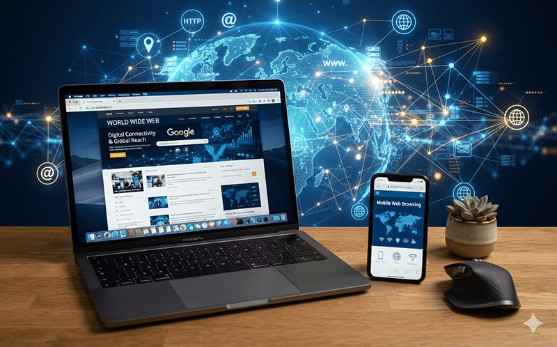
The way people access the internet has changed dramatically over the past decade. Today, smartphones have become the primary device for browsing the web, with mobile traffic now accounting for the majority of internet usage worldwide. Whether checking social media, reading the news, shopping online, or watching videos, users increasingly rely on the convenience of their mobile devices.
Desktop computers still play an important role, particularly for work, education, content creation, and tasks that require larger screens or more processing power. Activities such as editing documents, managing spreadsheets, graphic design, and complex online research are often more efficient on a desktop or laptop computer.
For businesses, this shift highlights the importance of having a mobile-friendly website. Sites that load quickly, feature responsive designs, and offer easy navigation on smaller screens provide a better user experience and are more likely to keep visitors engaged. At the same time, companies should not overlook desktop users, as many customers still complete purchases, fill out forms, or conduct business from traditional computers.
As technology continues to evolve, the gap between mobile and desktop experiences continues to narrow. Successful websites are those that deliver fast, secure, and user-friendly experiences across all devices, ensuring visitors can easily access information whether they’re at home, in the office, or on the go.